Before we start processing a sample image for the cinematic look let’s first try and understand what the cinematic look actually is. Images straight out of the camera (SOOC) carry the default factory settings. They are overtly bright and saturated. I am referring to the JPEGs here. This is one of the reasons why pros prefer to shoot in RAW with all the settings somewhat neutralised.
I personally prefer to shoot in RAW+JPEG. This way I can throw away the RAW files that I don’t intend to process (like family photos or test shots and other stuff) and retain the ones I mean to process when I reach home.
The reason I do so this is because RAW images are lossless files, which are less bright and less saturated than the final processed JPEGs SOOC. I can take these RAW files and process them the way I want without having to worry about losing image details. The fact that they are slightly less saturated helps me fine tune the look as I want. With JPEGs this is impossible to do. Every time I open edit and save a JPEG image I lose information.
Anyways, the cinematic look that I am referring to is something that looks like a RAW file out of a camera, except that it is less saturated and definitely lower in contrast. The image gives away the impression of a flat subdued color tone. Very moody. This is look popularized by films these days.
Now, the steps that I am about to list here may or may not work the same way for you images. You have the creative freedom to sway away from what I am about to type next and use your own preferences to arrive at what you feel or like.
Ok, customary caveat out of the way, let’s get started. By the way this is the image that we are going to edit. This is the RAW image saved as JPEG with no post-processing applied. I shot this image on a recent photo trip to an Indian village.

The Original Image
Step 1
The first step is to work on the color temperature. Depending on what white balance you had set for the image and the ambient color temperature of the scene you may need to pull the temperature slider to either right or left. The final target should be to keep the overall color temperature slightly warm. Not overboard just subtle.

Color temperature and tint adjusted
Step 2
Next is the turn of the brightness and contrast sliders. Brightness needs to be pulled in slightly. If the image has a histogram that is skewed to the left then probably you don’t need to pull the brightness slider too much to the left. Next is contrast. Pull the contrast slider down to the left. As soon as you pull the contrast to the left you will notice the image is getting transformed to the cinematic (desaturated look) you are after.
Step 3
Next are the Highlights, Shadows, Blacks and White sliders. Needless to say Highlights will be reduced. I’d prefer something like -75 or even higher depending on the image and the final effect. Whites will go down as well but not that drastically and so will the Blacks. However, I’d prefer not to reduce either the Whites or the Blacks all the way to the left. Shadows will remain untouched.
Step 4
Next are the Clarity, Saturation and Vibrancy sliders. Clarity is slightly tweaked. Tweak the Saturation slider to bring down the color saturation. Vibrance can remain untouched or slightly tweaked to the right to add some subtle Vibrance. Remember if you bring down the Saturation slider all the way to the left the image will lose all colors. We don’t want that to happen.
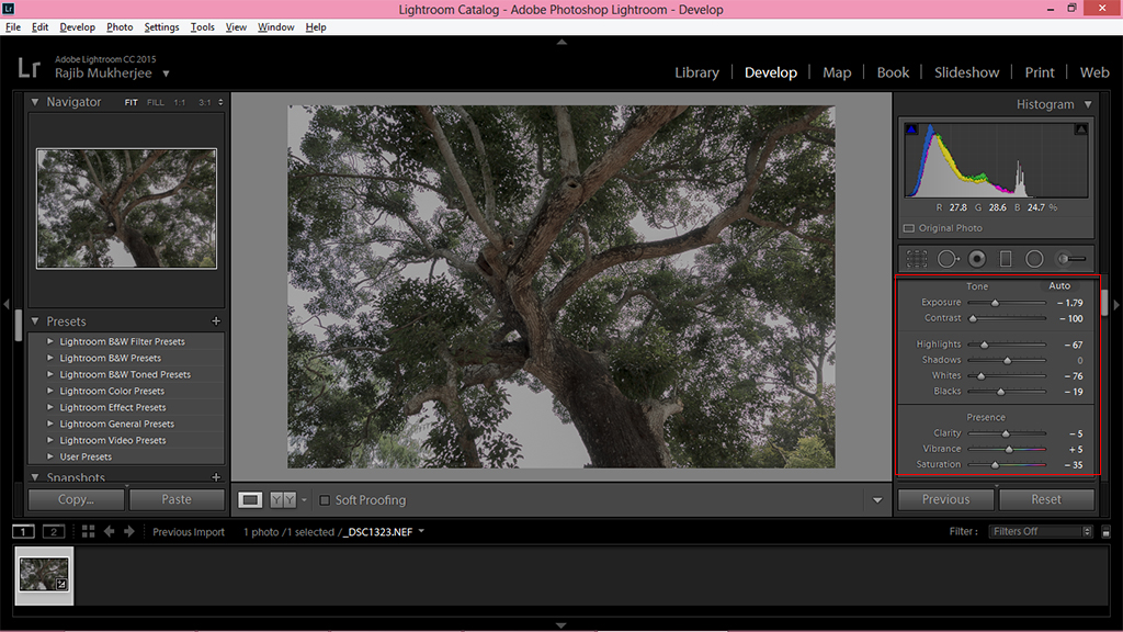
After Highlights, Whites, Blacks, Clarity, Vibrance and Saturation have been adjusted
Step 5
Now is the time to further desaturate any dominating colors in the image. For example if there is a vibrant red color patch, say a red car or a red building or a girl wearing a red dress, that needs to be tweaked to reduce the vibrancy. The same way if the image was shot at golden hour there would be an overabundance of orange and yellow tones in it. You can use the Selective Color Channel, select and pull down any offending colors to desaturate it. Else you can go to the Tone curve in Lightroom and do it from there. Here I used it to desaturate green and orange.

Desaturating dominating colors
Step 6 – The cinematic crop
The final task is to do a cinematic crop and apply the letterbox effect that ensures that your images appear as if they are screenshots saved from a film. The letterbox effect refers to the horizontal black bars that appear at the top and bottom of a movie.

Create a new layer and fill it with black
To do this open the image in Photoshop. Create a new layer. Fill that layer with black. Unlock the background layer (the original image layer). Put the new layer which you filled with black under the original background layer. Why? Because layer on when we crop the original background layer the layer beneath it will make the letterbox effect.
Step 7
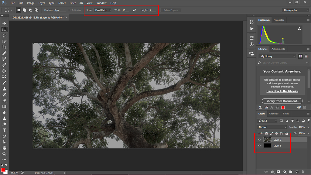
Select the aspect ratio as 16:9
Next we have to crop the image into a cinematic 16:9 ratio. You can use either the Rectangular Marque Tool or the Crop Tool in Photoshop to do this. Make sure whichever tool you select you set the ratio to 16:9. Once the image is cropped as per your preferred selection move on to the letterbox effect.
Step 8 – The Final Steps to Produce the Cinematic Look
You will need to make another crop of the original background layer for this. This reminds me try and leave ample space towards the top and bottom of your image. You are not going to need that and would save you from the embarrassment later on when you find you are having to crop out important elements.

The cinematic crop
The magic ratio that you have to remember for this cinematic look crop is 2.35:1. Use the Marque Tool (I love using it, more than the Crop Tool), and make a selection. But don’t do a crop yet. Instead make the selection a mask. What happens now is that you can move the mask around (after deselecting the chain icon between the mask and the layer). This allows you to correctly select the framing. Once you are happy with the look apply the Mask and make it permanent.

Apply the mask when you are happy with the selection
Chances are that the selection you made probably ended up with the different sized black bars at the top and bottom of the image. You have to make that identical. To do that select the whole image now.

Align the layer mask
Then click on Layer from the Main Menu > Align Layers to Selection > Vertical Centers. This will center the image vertically and in doing so make the top and bottom bars identical in size.
Here’s the final image with the cinematic look:
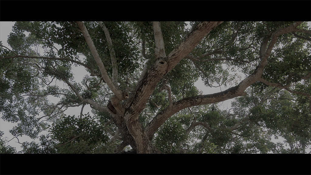
The final look
Go ahead and try this process to produce the cinematic look. Do share with us if you have a better technique.

Latest posts by Ben Novoselsky (see all)
- How To Store Photos So They Don’t Get Ruined - April 26, 2018
- Tricks for Mastering Long Exposure Night Photography - November 7, 2017
- Tips to Take Better Photos On Your Phone - October 29, 2017